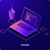
Discover Our Popular Courses

It is a long established fact that a reader will be distracted by the readable content of a page when looking at its layout

...
Card title

Some quick example text to build on the card title and make up the bulk of the card's content.

Price: 20$
...
Card title

Some quick example text to build on the card title and make up the bulk of the card's content.

Price: 20$
...
Card title

Some quick example text to build on the card title and make up the bulk of the card's content.

Price: 20$
...
Card title

Some quick example text to build on the card title and make up the bulk of the card's content.

Price: 20$
...
Card title

Some quick example text to build on the card title and make up the bulk of the card's content.

Price: 20$
...
Card title

Some quick example text to build on the card title and make up the bulk of the card's content.

Price: 20$

Explore The elearning Institute

There are many variations of passages of Lorem Ipsum available, but the majority have suffered alteration in some form, by injected humour, or randomised words which don't look even slightly believable. If you are going to use a passage of Lorem Ipsum, you need to be sure.
Anything embarrassing hidden in the middle of text. All the Lorem Ipsum generators on the Internet tend to repeat predefined

3.2K+

Online Course

600+

Expert member

1k+

Rating & Review

Ready to join?

It is a long established fact that a reader will be distracted by the readable content of a page when looking at its layout.

Frequently Asked Questions

It is a long established fact that a reader will be distracted by the readable content of a page when looking at its layout.

Grid and flexbox: The basic difference between CSS Grid Layout and CSS Flexbox Layout is that flexbox was designed for layout in one dimension - either a row or a column. Grid was designed for two-dimensional layout - rows, and columns at the same time.

Developers describe Bootstrap as "Simple and flexible HTML, CSS, and JS for popular UI components and interactions". Bootstrap is the most popular HTML, CSS, and JS framework for developing responsive, mobile first projects on the web. On the other hand, Tailwind CSS is detailed as "A utility-first CSS framework for rapid UI development". Tailwind is different from frameworks like Bootstrap, Foundation, or Bulma in that it's not a UI kit. It doesn't have a default theme, and there are no build-in UI components. It comes with a menu of predesigned widgets to build your site with, but doesn't impose design decisions that are difficult to undo.

The CSS box model is a container that contains multiple properties including borders, margin, padding, and the content itself. It is used to create the design and layout of web pages. It can be used as a toolkit for customizing the layout of different elements. The web browser renders every element as a rectangular box according to the CSS box model.

Semantic HTML tags allow you to add meaning to your markup so that search engines, screen readers, and web browsers can make sense of it. By default, when a user agent reads your content it does not understand the context and meaning. Semantic HTML tags let you serve structured content to your users, which is especially important for on-page SEO and accessibility.

Trusted by over 800+ companies